
Choosing the right color palette for your home is a crucial aspect of interior design. The colors you select can significantly impact the overall aesthetic and ambiance of your living spaces, influencing everything from the mood to the perceived size and functionality of a room.
Understanding Color Theory
The Color Wheel
At the heart of color theory lies the color wheel, a visual representation of the relationships between different hues. The color wheel is divided into three primary colors (red, yellow, and blue), three secondary colors (orange, green, and purple), and six tertiary colors (yellow-orange, red-orange, red-purple, blue-purple, blue-green, and yellow-green). Understanding the placement and interactions of these colors is essential for creating harmonious and visually appealing color palettes.
Color Schemes
Monochromatic: A monochromatic color scheme is based on a single hue and its various shades, tints, and tones. This approach can create a cohesive and calming atmosphere, but it may also feel somewhat limited if not balanced with other design elements.
Analogous: Analogous color schemes utilize three adjacent colors on the color wheel, such as blue, blue-green, and green. These harmonious combinations can produce a sense of visual flow and unity within a space.
Complementary: Complementary color schemes pair colors that are opposite each other on the color wheel, like red and green or blue and orange. This bold and contrasting approach can create a visually striking and dynamic effect.
Triadic: Triadic color schemes use three colors that are evenly spaced around the color wheel, such as red, yellow, and blue. This scheme can be vibrant and energetic, but it requires careful balance to avoid overwhelming the space.
Tetradic: Tetradic color schemes incorporate four colors that are adjacent on the color wheel, like red-orange, yellow-orange, yellow-green, and blue-green. This approach can produce a harmonious and sophisticated palette, but it may require more deliberate coordination.
Warm vs. Cool Colors
Colors can be broadly categorized as either warm or cool. Warm colors, such as red, orange, and yellow, tend to feel cozy, inviting, and energizing. Cool colors, like blue, green, and purple, often have a calming and serene effect. Understanding the characteristics of warm and cool colors can help you create the desired mood and atmosphere in your home.
Neutrals
Neutral colors, including white, black, gray, beige, and brown, play a crucial role in color palettes. These colors can serve as a foundation for more vibrant hues, creating balance and allowing other colors to shine. Neutral tones can also be used to create a sense of timelessness and sophistication in a space.
Factors to Consider When Choosing a Color Palette
Room Size and Lighting
The size of a room and the amount of natural and artificial lighting can significantly influence how colors are perceived. Lighter, cooler colors can make a small space feel more open and airy, while warmer, darker tones can create a cozy and intimate atmosphere in a larger room.
You may also read (6 story house)
Existing Furnishings and Decor
When selecting a color palette, it’s essential to consider the existing elements in your space, such as furniture, flooring, and wall finishes. Coordinating new colors with these existing elements can help create a cohesive and harmonious design.
Personal Preferences and Lifestyle
Your personal style, preferences, and lifestyle should be the primary drivers when choosing a color palette. Select colors that reflect your personality and make you feel comfortable and at home.
Mood and Atmosphere
Colors have the power to evoke specific moods and atmospheres. Warmer tones can create a sense of energy and vibrancy, while cooler hues can foster a calming and relaxing ambiance. Consider the desired mood and atmosphere you want to achieve in each room.
Applying Color Palettes in Different Rooms
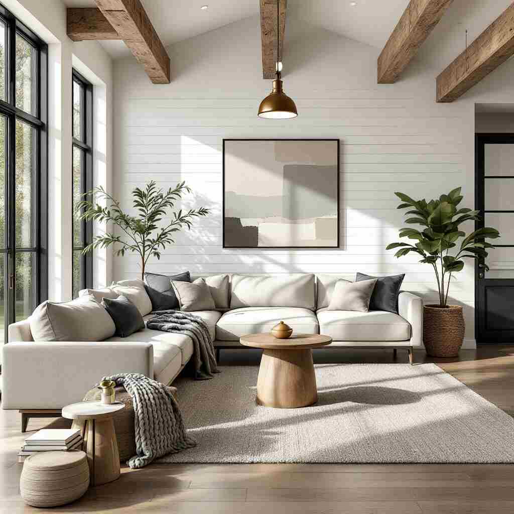
Living Room
In the living room, consider using a combination of warm and cool tones to create a balanced and inviting atmosphere. Earthy neutrals, such as beige and gray, can provide a solid foundation, while pops of color in the form of accent pieces or textiles can add visual interest.
Bedroom
The bedroom should be a serene and relaxing oasis, so opt for soothing color palettes that promote rest and rejuvenation. Soft blues, greens, and neutrals can create a calming ambiance, while touches of warm accents can add coziness.
Kitchen
The kitchen is often the heart of the home, so consider using vibrant, energetic colors to reflect the lively and social nature of this space. Bright whites, cheerful yellows, and bold accent colors can create a welcoming and inviting atmosphere.
Bathroom
Bathrooms can benefit from calming, refreshing color palettes that evoke a spa-like atmosphere. Soft blues, greens, and whites can create a serene and rejuvenating environment, while pops of color in the form of towels or accessories can add visual interest.
Home Office
When designing a home office, consider using colors that promote focus and productivity. Neutral tones like gray and beige can provide a solid foundation, while strategic use of blue and green hues can help create a calm and focused workspace.
Transitioning Between Rooms
Achieving a cohesive flow between rooms is essential for creating a harmonious and visually appealing home. When transitioning between color palettes, consider using a common neutral or accent color to tie the spaces together. Gradually shifting the intensity or temperature of the colors can also help create a seamless transition.
Incorporating Accent Colors
Accent colors can be used to add visual interest, highlight specific design elements, and bring a sense of personality to a space. These pops of color can be introduced through decorative accessories, textiles, or even a bold statement wall.
Updating and Refreshing Your Color Palette
Over time, your color preferences and design needs may change. Regularly updating or refreshing your color palette can breathe new life into your home and keep it feeling fresh and modern. Consider gradual changes, such as swapping out accent pieces or introducing new textiles, to gradually evolve your color scheme.
Conclusion
Choosing the right color palette for your home is a crucial aspect of interior design that can significantly impact the overall aesthetic and ambiance of your living spaces. By understanding color theory, exploring various color schemes, and considering key factors like room size, lighting, and personal preferences, you can create a harmonious and visually appealing color palette that reflects your unique style and enhances the functionality of your home. Remember to have fun with the process and don’t be afraid to experiment – the perfect color palette is waiting to be discovered.
You may also read (impact lighting design home)