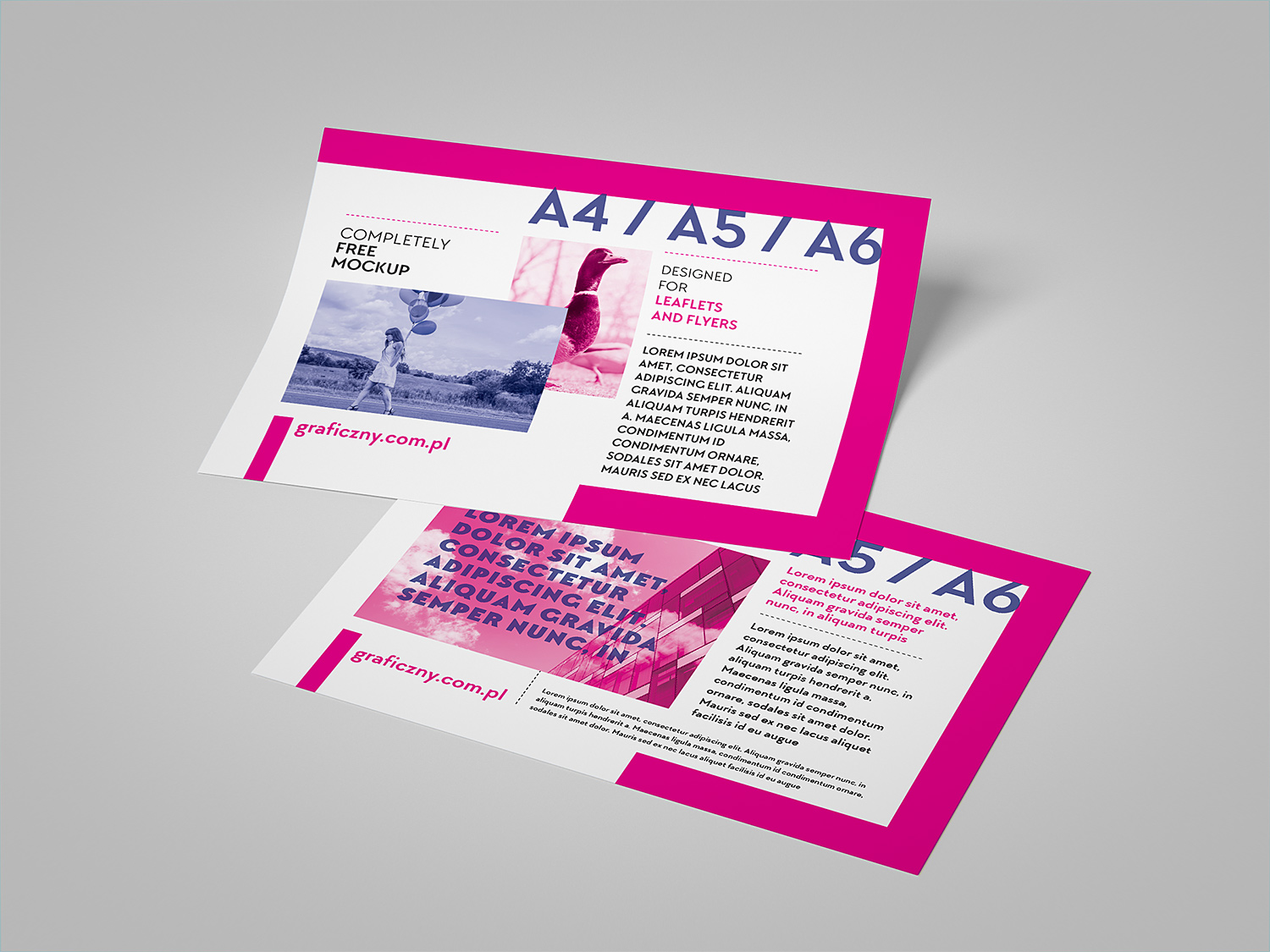
Leaflet Design Ideas – 2024
Leaflets. Those little paper warriors fighting for precious moments in your target audience’s day. They deserve to be noticed, not crumpled and tossed.
Here’s how to craft a leaflet that grabs eyeballs, spills the beans (in a good way), and gets people to take action (without feeling like they’re being marched to order).
1. Eye Catching Graphics And Images
Skip the clip-art graveyard. Think vibrant photos, quirky illustrations, or anything that screams, “Hey, look at me!” Bold colors, cool shapes – anything to make your leaflet stand out from the beige abyss.
2. Compelling Headlines And Taglines
First impressions are everything, and your headline is your leaflet’s opening line. Make it catchy, clear, and maybe even a little funny. Intrigue is your friend. Think of it as a movie trailer – you want people to know there’s a story worth watching (or in this case, reading).
3. Clear And Concise Messaging
People are busy. Don’t bury your message in a text avalanche. Bullet points, short paragraphs – keep it snappy. Highlight the benefits of what you’re offering, like a superhero listing their awesome powers. Dates, times, contact info – crystal clear, because nobody likes a guessing game.
4. Interactive Elements
QR codes, those little black and white squares, can be your secret weapon. Scan them and, bam! They whisk users to a hidden world of videos, special offers, or even a cat meme dance party (because who wouldn’t want that?). Tear-off coupons? Those work too. Just give clear instructions on how to use these goodies, or you’ll have folks scratching their heads like a dog trying to open a fridge.
5. Creative Fold And Die Cut Designs
Ditch the boring rectangle. Experiment with folds and shapes that make your leaflet stand out. Think triangles, squares with surprise cutouts, or even something that unfolds into a tiny paper airplane (because who doesn’t love a good paper airplane?).
6. Typography And Font Pairing
Fonts are like clothes for your words. Choose ones that reflect your brand’s personality. Play with sizes and styles to create a hierarchy (like a headline shouting and the body text whispering secrets).
7. Use of White Space
Don’t cram everything together. Leave some breathing room for your text and images. It makes things easier to read and gives your design a polished, sophisticated look.
8. Brand Consistency
Colors, fonts, images – keep them consistent with your brand. Like a superhero’s costume, it helps people recognize you in a flash.
9. Unique Finishing Touches (That Makes People Say “Wow”)
Think special coatings that make your leaflet shimmer, or embossing that adds a cool texture. Unusual paper stocks can add a touch of class (and make people think, “Hey, they put some real thought into this!”).
10. Call To Action
Tell people what you want them to do next. Visit your website? Sign up for a class? Make it clear and easy. Think of it as a friendly nudge in the right direction.
So, there you have it! Your leaflet’s ready to conquer the world (or at least get a few good reads). Remember, people are bombarded with information. Make your leaflet the one that cuts through the noise and gets remembered. Now go forth and leaflet like a champion!


