The Do’s and Don’ts of Mixing Patterns in Interior Design?
Mixing patterns can add depth and visual interest to a room, but it can also be overwhelming if not done correctly. This post will provide a comprehensive guide on the do’s and don’ts of mixing patterns in interior design.
Understanding Patterns
A pattern is a repeated design element used in interior design to create visual interest. There are several common types of patterns:
Solid Colors: A single colour used as a background or accent.
Stripes: Horizontal or vertical lines of the same colour.
Florals: Floral motifs are used as a design element.
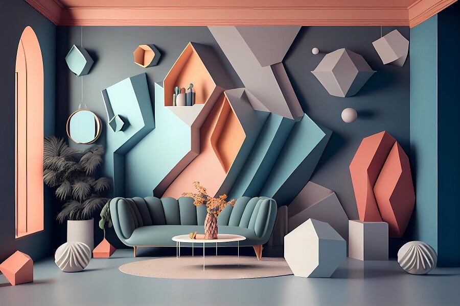
Geometric: Geometric shapes are used as a design element.
Pattern scale is also an important consideration in interior design. This refers to the size of the pattern and how it relates to the size of the room and furnishings. Choosing the right scale is key for mixing patterns successfully.
Do’s of Mixing Patterns
When mixing patterns in interior design, here are some best practices to follow:
1. Start with a Neutral Background
Use a neutral background like white, beige or gray to create a foundation for mixing patterns. The neutral background helps anchor the patterns and prevents them from competing.
2. Choose Patterns with Similar Colors
Select patterns that share similar colours, such as different blue patterns or patterns with red and pink accents. This creates a cohesive look even when combining very different patterns.
3. Mix and Match Pattern Scales
Don’t be afraid to combine patterns with dramatically different scales, like large florals and narrow stripes. The contrast in scale adds visual interest. Just be sure to balance the scales throughout the room.
4. Use a Unifying Element
Tie patterns together using a common color, texture or shape. For example, patterns with metallic accents or all patterns with a circular motif. This creates harmony among the patterns.
5. Balance Patterns
Distribute patterns evenly throughout the room. Don’t cluster too many patterns in one area. A balanced distribution allows the eye to flow through the patterns.
6. Experiment with Different Patterns
Don’t be afraid to try bold or unexpected pattern combinations. Mixing classic stripes with modern geometrics can yield exciting results.
Don’ts of Mixing Patterns
While mixing patterns opens lots of possibilities, there are also some pitfalls to avoid:
1. Avoid Overwhelming the Space
Too many competing patterns can overwhelm a room. As a general rule, select 3-4 patterns maximum for a cohesive look. More than that risks visual chaos.
2. Don’t Mix Patterns with Clashing Colors
Make sure the colours of the patterns you select complement each other. Patterns with clashing hues like neon orange and lime green are jarring.
3. Don’t Use Too Many Patterns with Different Scales
Stick to 2-3 pattern scales max. For example, combine a large floral, medium stripe and narrow geometric. Too many scales make a space feel busy.
4. Don’t Forget About Texture
Consider the textures of the patterns and how they work together. A space with only flat, matte patterns lacks depth. Incorporate patterns with sheen, embroidery or carvings.
5. Don’t Ignore the 60-30-10 Rule
This classic interior design rule states that 60% of surfaces should be a dominant colour, 30% a secondary colour and 10% an accent colour. Use this as a guide when selecting patterns.
Conclusion
Mixing patterns can add exciting contrast and visual interest to any interior. By following the guidelines above on balancing scales, colours and placement, you can effortlessly mix patterns for a pulled-together look. Don’t be afraid to experiment with bold, unexpected combinations too. Let us know your favourite pattern mixes in the comments below!


